The iDEA logo comes in three different formats.
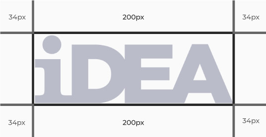
Logo spacing
The iDEA logos should always be given adequate spacing to breathe when used in content.
While the exact padding may differ depending on font and resolution size, we recommend keeping to padding of 17% of the width of the logo. For example:
Main logo

The main logo can be used as:
- Navy on a white background
- An iDEA Colour on a white background
- White on any background, preferably on an iDEA colour
Simple crest logo
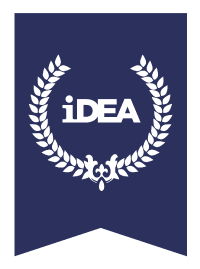
This version of the logo is usually in navy, but can also be used in Bronze, Silver and Gold colours to signify a specific award level.
This version of the logo tends to be used on badge pages, for example:
Award crest variations:
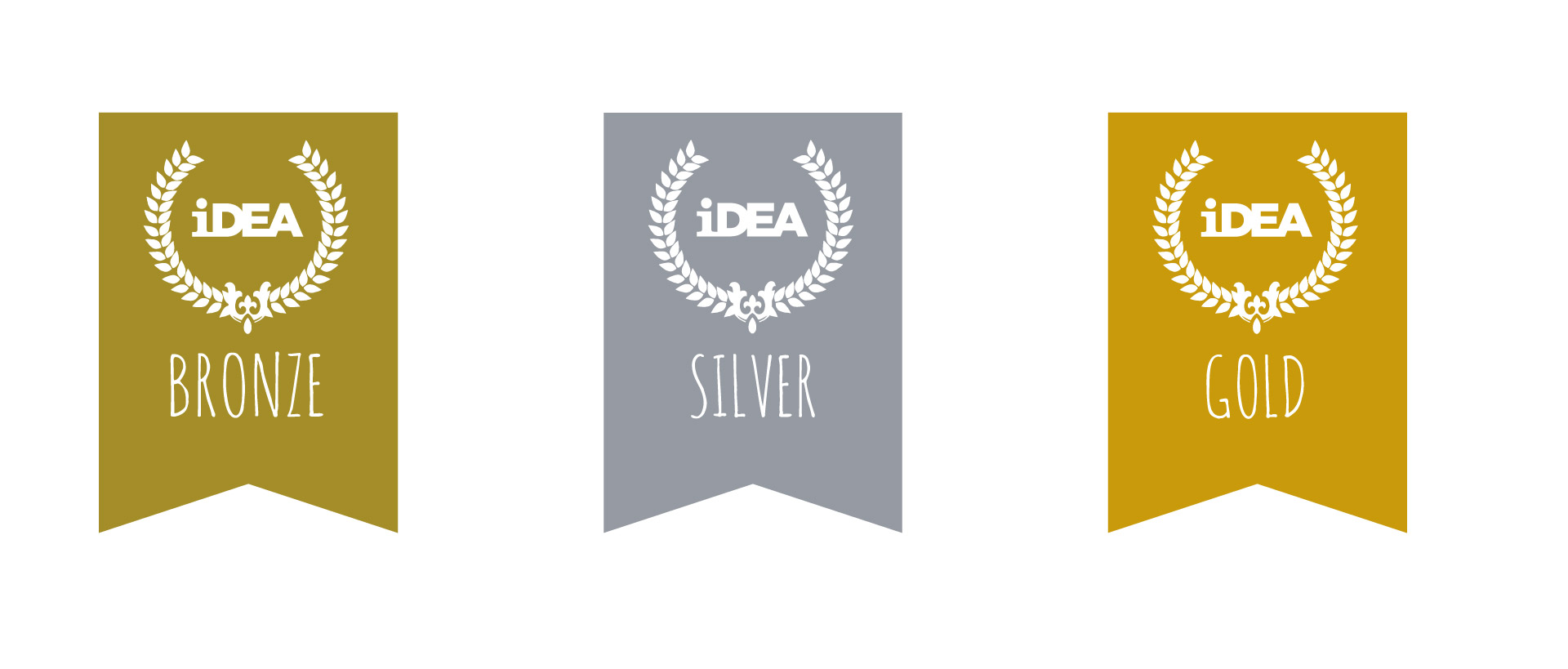
Award crest logo
- This variant of the logo will always be Bronze, Silver or Gold, on white, Bronze, Silver or Gold backgrounds.
- They are used on iDEA Certificates and iDEA Records of Achievements.
Category icons
iDEA content is made up of six categories. Citizen, Entrepreneur, Maker, Gamer, Worker and Independent. Each category has its own logo icon, which can be used on relevant content.